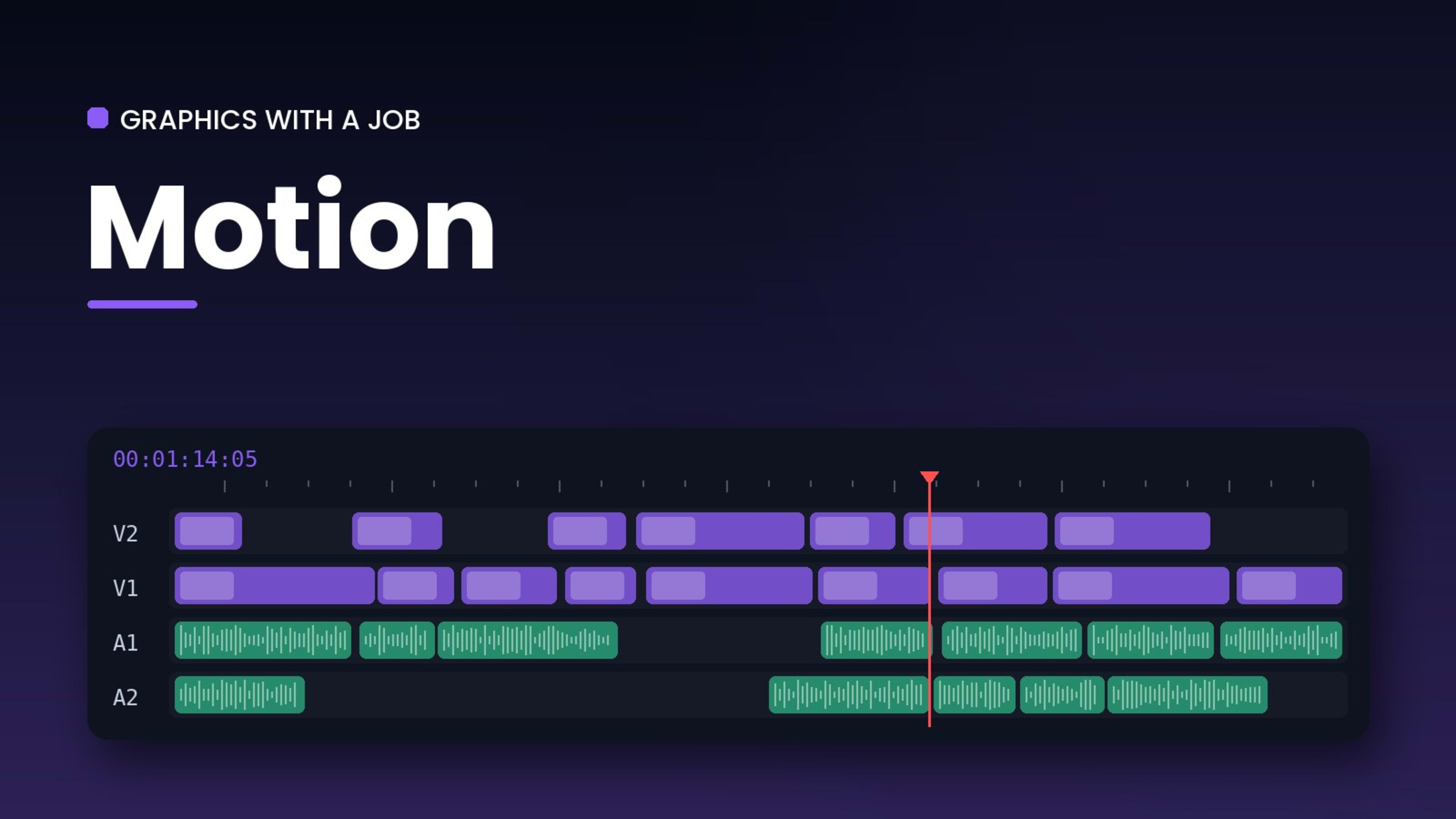
Motion graphics can make a video look expensive, or make it look like a template. The difference is whether they serve the story.
Every graphic needs a job
A lower third tells you who is speaking. A number on screen makes a statistic stick. A map shows where we are. If a graphic doesn't have a job like that, it is decoration, and decoration competes with the message.
Match the brand
Fonts, colours and the style of animation should match the brand's identity. A consistent set of titles and lower thirds also makes a series of videos feel like one channel rather than a collection.
Move with purpose
Animations should be quick and confident. Most text needs a fraction of a second to arrive and should then stay still long enough to read comfortably, roughly the time it takes to read it twice.
Respect the safe areas
On social platforms, interface elements cover the edges of the frame. Keeping text inside the safe areas means nothing important ends up under a like button.
Build once, reuse
In After Effects I build reusable templates for recurring elements such as titles, lower thirds and end cards. Clients get consistency, and later videos in a series get faster to deliver.
Comments (0)
No comments yet. Start the conversation.
Join the conversation
Sign in or create a free account to comment.